Mastering Dashboards in Audit Decision Making & Certification
Apr 18, 2019In today’s highly digitized world, data are ubiquitous yet often overwhelming. While new technologies such as Artificial Intelligence and Machine Learning promise to provide previously unimagined insights, most businesses fall short in even using the essential data they already have.
Before aiming for advanced analytics, you should get your basic analytics setup straight. Data exploration and data visualization are a lot of work. However, done properly, they will not only inform but improve your decision making.
Dashboards—Key Performance Data at a Glance
Dashboards can help you to get your head around otherwise difficult to grasp data. They give you a clearly structured overview of your organization’s most important performance indicators by breaking down the organization’s complexity to certain numbers, graphs, maps, or plots. A well-designed dashboard can help you to answer questions like:
- How many audits did I perform with which auditors in a certain time span?
- How many non-conformities occurred at a certain site over a certain time span?
- Are there any auditors, certification bodies, or audited companies performing out of the normal?
- Are there any trends I should react to?
I am sure that there are many other questions that you would like to have answered with the help of data, with the results being presented in a handy dashboard.
Beware of These Pitfalls
While dashboards can be extremely useful, there are certain pitfalls to be aware of.
Data Quality—Garbage In, Garbage Out
No matter your goals, the quality of your data is the single most vital thing to be concerned about. If you enter low quality—incomplete, biased, or incorrect—data into your system, you cannot expect to get meaningful results. In fact, putting bad data onto a dashboard could make your situation even worse. The nice-looking graphs and the clear structure of the dashboard immediately create confidence in the data you see, even if it is all garbage. Always be aware of this mental bias and do not fall for the design itself.
Reduction of Complexity
Dashboards reduce the perceived complexity of data by organizing and presenting it neatly. However, if you try to condense multiple variables and numbers into a single Key Performance Indicator (KPI), you could run into troubles. If you, for instance, would want to measure auditor performance with a single KPI, you would probably want to pack in the number of findings per category, the audits performed within a certain period, the average performance of other auditors, and other very specific things such as the number of “twilight” audits being close to a certain percentage reached in an audit. I think it is needless to say, that the interactions between all those numbers make this very tricky with the risk of a misleading result. The bottom line here is: do not try to overly reduce the complexity of your data unless you know what you are doing.
How To Design an Excellent Dashboard
What the perfect dashboard looks like for you largely depends on the questions you want to answer. However, there are some basic principles that they should take into account when building a dashboard.
Ideally, you build dashboards with a team consisting of at least one domain expert, a data engineer, and a BI designer/engineer. While the domain expert knows what to look for and what pitfalls to be aware of, the data engineer has profound knowledge on how to organize, extract and wrangle data to ensure data operability. The BI designer/engineer job is to design and build the business intelligence tools needed, including dashboards. Depending on your questions and needs, you might also consider adding more members to your team. Check out my article on the Data Science Dream Team to learn more.
The second thing that makes an excellent dashboard is clarity. It might sound trivial or even contradictory, but do not overload your dashboard with information. Better focus on the information needed to answer a specific question and consider building a second or multiple dashboards to answer your other questions. Also, ad an explanation (tooltip) to each and every number, graph, or map explaining precisely what the indicator means, how it was calculated, and how it is to interpret.
Next Stop: Explorative Business Intelligence
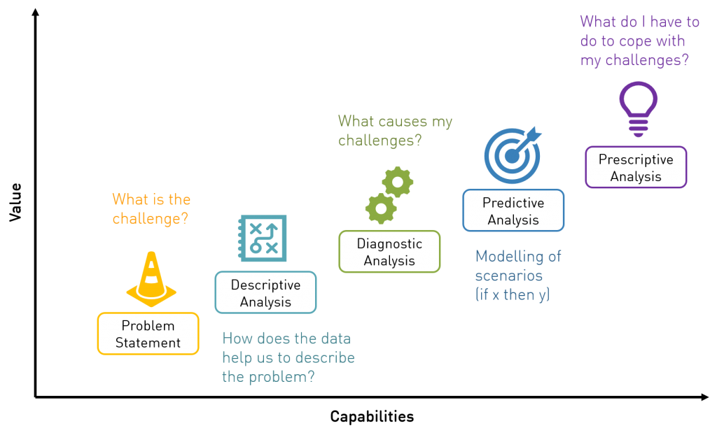
Dashboarding is a very convenient way of looking into the rear mirror and analyze what happened in the past. However, this is not the only way of approaching your data. Advanced analytics can help you to not only look back in time but also get a glimpse into the future. In other words, dashboards are a form of descriptive analysis allowing us to see trends, clusters, and extreme values. Most people stop here. However, when talking advanced analytics, this is only the starting point. Learn about the possibilities advanced analytics can offer in my article 5 Steps to Make Better Audit Decisions.